A brand the whole team can use
By 2026 we had a logo, but not a full brand around it. I led a refresh designed by Brass Creative House, then implemented it, carrying the new identity into our marketing and our website.
Brand design by Brass Creative House · Illustrations by Rocio Diestra · Implementation across our marketing and website by me
The problem
The original mark worked, and people liked it, but there was no system around it: no set palette, no type rules and no visual language. Materials looked different depending on who made them, and the brand didn't yet reflect a team that uses technology well and cares about the people it serves.
Constraints
Non-designers apply it
The team creates owner emails, tenant notices and internal materials themselves, every day.
Keep what works
The original mark had recognition worth keeping, so the refresh had to build around it.
Warm and modern
It needed to feel forward-thinking without losing the warmth and credibility people expect from someone managing their home.
Key decisions
Brass designs, I lead and deliver.
Brass Creative House designed the strategy and identity. I led the project on our side, and then implemented it myself, so the brand showed up where people actually see it.
Build around the original mark.
Keeping the existing logo as the anchor gave the new palette, type and illustrations something familiar to grow from.
Start with what people see.
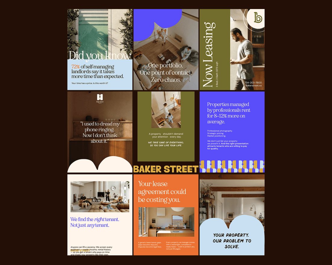
I carried the new brand into our marketing first, across email campaigns, social media and the monthly deck, so owners and tenants saw the change right away.
Bring the website along.
I updated the website to match, so every place someone met the company told the same story.
Make on-brand the easy option.
I built a social post generator and an icon and illustration generator, so the team could make new on-brand content quickly without starting from scratch.
New icons in the brand's style
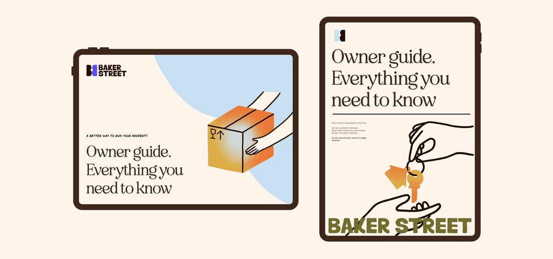
A few new pieces I made with my generator and prompt guides, matching the illustration style Rocio Diestra created for the refresh.



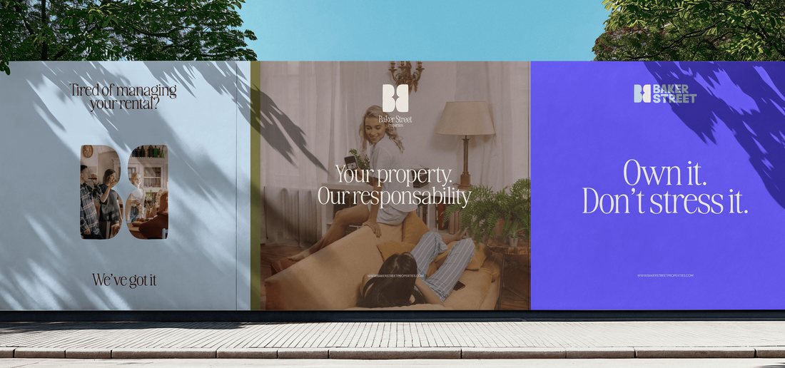
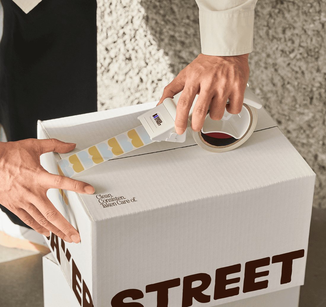
The refresh in use
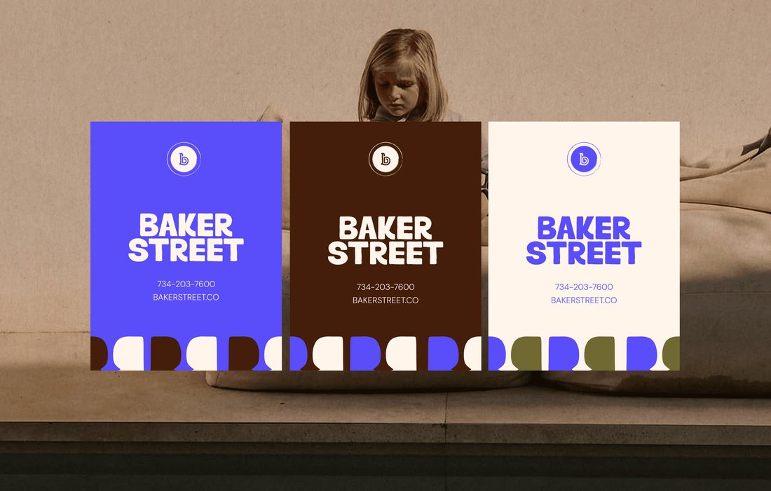
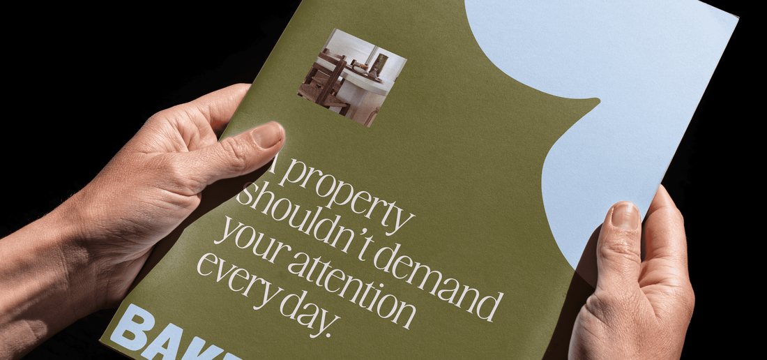
A few of the applications from the refresh. Mockups by Brass Creative House; illustrations by Rocio Diestra. You can see the full project on their site.
Outcome
- A full identity, designed by Brass Creative House, around the original mark: palette, typography, illustrations and graphic language.
- The new brand carried into our email campaigns, social media, the monthly leadership deck and the website.
- A social post generator and an icon and illustration generator, so new content matches the brand without starting from scratch.
What I'd do differently
- Plan the rollout alongside the design work, so the new brand reached every channel at the same time.